THE CALIFORNIA CLOSETS MAGAZINE
Rising up in the center of the city, a reflective jewel of glass and steel, with an atrium at the top cantilevered impossibly over the floors below, the structure seems to defy gravity. Entering from the street, visitors ride a glowing yellow escalator upstairs to the Living Room, where high glass ceilings offer sweeping views of the city, and large armchairs invite both chatter and contemplation. Meander the rest of the state-of-the-art building and discover art installations, meeting rooms, personnel to cater to a variety of needs, and at the very top, another light-filled lounge with breathtaking views of neighboring Elliott Bay and Mount Rainier.
Boasting all of the above—bustling glamour, accessible culture, a traveler’s mecca—the Seattle Central Library is a dream realized. In fact, when it opened in 2004, The New York Times called it “a blazing chandelier to swing your dreams upon.” A gleaming symbol of collaboration, innovation, and beauty, a modern cathedral to the exchange of information, the library allows old and new media to harmoniously comingle, as do its patrons, with wildly divergent missions. In this reimagined vision of the public library, academic research, storybook time, online dating, professional teamwork, and coffee with a friend (via the coffee cart on level three) are of equal import.

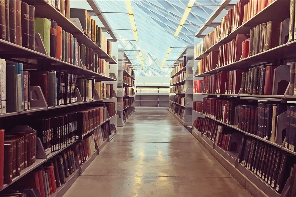
The Seattle Central Library has capacity for 1.5 million books, many of which are housed in the block-long Book Spiral.
This vision was not arrived at hastily. When Pritzker Prize–winning Dutch architect Rem Koolhaas and his design team Office for Metropolitan Architecture (OMA) delivered their final proposal to Seattle’s library board in 1999, they asserted that the current conceit of a library consisted of “one kind of literacy” that “blinded it to other emerging forms that increasingly dominate our culture, especially the huge efficiencies (and pleasures) of visual intelligence.” Rather than perceiving technology as the enemy of libraries, OMA asserted, it enabled “the realization of ancient ambitions—totality, completeness, dissemination, accessibility.” It was also of paramount importance to reclaim free public space for the city—a noncommercial haven away from inclement weather and other distractions.
The vision started with a deep analysis of the library’s current responsibilities. As part of OMA’s research, the design team organized the Seattle library board’s self-reported list of functions into a color-coded bar graph that represented categories such as books and media, programming, social roles, and administration. According to Joshua Prince-Ramus, a founding partner of OMA and a Seattle native, the board maintained that its only mandate was the dissemination of books and media. But when OMA regrouped the matrix, it was able to show that only one-third of the library’s functions related to books and media, while the bulk of activity was social. The librarians were convinced.
A dry, rational structure became lyrical by engaging with nature and capturing the imagination of the city as a whole.
This bar graph would turn into the physical representation of the library. Using the proportions of the graph, OMA created boxes stacked as levels, or floors. Then they pushed the bars like Jenga pieces to maximize light, height, and visibility. “We shifted the boxes so they could capture all the surrounding features of nature,” Koolhaas says. “Each layer was addressed to the mountain, addressed to the port, addressed to the skyline. So a dry, rational structure became lyrical by engaging with nature and capturing the imagination of the city as a whole.” A metal and glass grid, or “skin,” connected the blocks and brought the structure into cohesion.
The most innovative feature of the Seattle Central Library is the Book Spiral, a rectangular, block-long “parking garage for books,” according to Prince-Ramus. Browsers can climb, at an almost imperceptible incline, along the exterior of each level, dipping into rows of bookshelves that fan inward like parking spaces. The majority of the library’s nonfiction books has a place here in the Dewey decimal system, which accommodates for future growth of the collection (there is a 1.5 million book capacity) and accidental discoveries, “where you kind of look at books that are not necessarily the books that you’re aiming for,” Koolhaas told The Seattle Times in 2008.

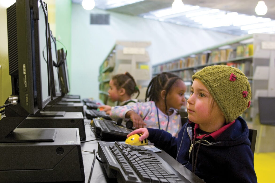
Inclusivity is a key element of the library’s offerings. The Children’s Center, for example, offers story time in several languages, as well as computers for these digital natives.
This massive spiral evokes the interwoven strands of DNA, and, like DNA, it is the generative epicenter of the structure, the stories and knowledge from which all newer technologies and human activity emanate. While this organization system is a highly structured single sequence, the experience of walking the Book Spiral is anything but. It was designed to “create a kind of almost arbitrariness,” Koolhaas said. “To create a walking experience, an urban walk.”
Every element of the rest of the library is deliberate, dynamic, efficient, and inclusive. There’s the Children’s Center, complete with stroller parking, family restrooms, story time in a variety of languages, and 80,000 books, DVDs, CDs, and other items. A Microsoft theater (the Bill & Melinda Gates Foundation gave $20 million to the project, the largest gift to a public library at the time) provides a venue for lectures, seminars, and screenings that spans two levels. Womb-like corridors bathed in red paint lead to neutral-colored meeting rooms tucked into the fourth floor, presenting opportunities for more formal interaction and collaboration. The Mixing Chamber offers technological resources, including a large computer lab, job boards, scanners and image editing equipment, and study tables. The second level, closed to patrons, is where the magic of book sorting happens—though it’s hardly magic at all. A conveyor belt system sorts books by category, positions them all with spines in the same direction, and whisks them pneumatically to their rightful spots.
Susan Hildreth, a professor of practice at the Information School at the University of Washington, has worked at libraries her entire career, including the Seattle Public Library system. “[The Central Library] is a place where people who live here bring family or friends who are visiting. It’s a tourist attraction.” Ten years after the opening of the Seattle Central Library, Koolhaas put it best when he wrote in Content (OMA’s follow-up to S,M,L,XL), “Maybe, architecture doesn’t have to be stupid, after all. Liberated from the obligation to construct, it can become a way of thinking about anything—a discipline that represents relationships, proportions, connections, effects, the diagram of everything.”